
COLOUR OF NATURE
AND BIOPHILIA
by HARRIET THORPE
It is no coincidence that blue, the colour most present in nature, seen in the sky and sea, is consistently chosen as a ‘favourite colour’ across the world. While meditating on the sea’s flat horizon line, or opening the curtains up to a cloudless sky, we may think of blue as a simple pleasure, yet its tranquil properties are complex, and rooted in its long light wavelength and our human evolution.
As hunter gatherers, we learnt to understand nature through colour – it showed us when the seasons were changing, or when a fruit was ripe. While we have learnt to read these signals, and control them, for our continued survival, the colours of nature feed us emotionally and spiritually too. That cluster of wild purple flowers blooming by the motorway for example, remind us that though we continue to test nature, we are part of a bigger eco-system, independent of our control, which can rebound even in the toughest conditions.
Throughout history, we have sought to cultivate nature for pleasure, by taming it and preserving it. Flowers have been used for centuries as religious offerings. Fern hunting was a popular past-time for the Victorians. In the 20th century Frank Lloyd Wright and Lina Bo Bardi consciously designed the experience of nature into homes, and the Ford Foundation pioneered how we could live alongside pines, figs and bougainvillea even in a corporate office in the midst of Manhattan.
The word ‘biophilia’, meaning ‘love of life’, captures this innate connection we have with nature. It was first used in 1964, by German psychologist Erich Fromm, whose theories were rooted in the story of Adam and Eve. In 1984 American biologist Edward O Wilson defined it as a subconscious urge to connect with other living things. Then in the late 20th century scientific research – such as NASA’s 1989 discovery that house plants could purify air, or Janine Benyus’s 1997 work on biomimicry, which showed how modern technology could learn from nature – recognised biophilia as a valuable design tool.
Colour was a significant factor in the biophilic design framework of Stephen R. Kellert, professor of social ecology at Yale University, established in the first decade of the 21st century. Out of his six categories, the first one, ‘Environmental features’, which specified that well-recognised characteristics of the natural world should be presented in the built environment, colour was the first attribute. In addition to colour, factors such as natural materials and light, views of nature and organic shapes were deemed essential to biophilic design.
Far more than a trend, or simply painting a wall green, biophilic design is a holistic treatment in which colour will naturally manifest through materials, plants and views to the outdoors. This means the earthy neutrals seen in wood or natural fibres, the changing colours of real plants or the blue of the sky on a clear day framed by a window. No doubt, we will feel instinctively ‘better’ – stress reduced, concentration improved, happiness boosted – because we feel returned to an environment closer to nature, where historically we belong.
WELLBEING AND THE
PSYCHOLOGY OF COLOUR
by HARRIET THORPE
Speaking scientifically, colour is a wavelength of light detected by our eye. On entering our eye, it stimulates the pituitary and pineal glands, which causes the production of hormones, and in turn various psychological and physiological reactions. While certain reactions will be universal and scientific, many will be personal and cultural, connected to memory.
It has taken centuries to fully understand the psychological impact of colour on us. In the 1600s, Isaac Newton distilled colour into wavelengths, yet it wasn’t until a century later that Goethe started to explore the symbolism and effects of colour in space. Later, Swiss art theorist and Bauhaus teacher Jonathan Itten’s 12 colour wheel (which we are most familiar with today), furthered research on complementary colours, becoming a key influence to the Op Art movement.
As well as creating optical illusions, certain colour combinations were discovered to have universally stressful or calming affects on us. Overuse of complementary colours created over-stimulation, which contributes to stress – increasing pulse, muscle tension. While too many analogous and achromatic colours created under-stimulation (think of the monotonous colours of prisons, hospitals or warehouses), contributing to restlessness and irritability.
If we consider colours in isolation, the most calming colour of all is considered to be green. Our cone cells are most sensitive to light wavelengths at 550 nanometers, where green sits on the spectrum, so it is scientifically ‘easiest’ for us to see. Though in 1979 Dr. Alexander Schauss was convinced that his shade of bubblegum pink, ‘Baker-Miller pink’, had powerfully calming properties after his experiment on violent prisoners in cells, though the study was later contested.
Colours we feel comfortable with are often subjective. Not only because we each have unique receptors in our eyes, but because colour preference is connected to our age, personality type and memories. Generally, younger people prefer saturated and primary colours, while older people more subdued hues. An introvert might opt softer, and an extrovert bolder. A happy association with a colour might manifest elsewhere in our lives. This is why our homes, where we feel most comfortable, usually look very different.
Though beware, marketing professionals have learnt how to take advantage of our attachments to colour. Mcdonald’s red and yellow logo has become synonymous with fast food, and might even induce cravings on its cultural reference alone. However, it was a result of careful market research into colour psychology, bringing together feelings of happiness (yellow) and passion (red). These highly saturated colours appeal to children, and most likely induce stress in their parents.
When it comes to designing colour for everyone’s wellbeing such as in public buildings, a balance of all these factors needs to be considered. Colour has great power to enhance our lives; Bruno Taut brought colour to social housing to uplift spirits; Alvar Aalto used colour to improve way finding and function at the Paimio Sanatorium; while designers of Maggie’s Centre cancer care facilities add brightness to help health. Like in most areas of wellness, when using colour, a healthy balance is key.

HISTORY OF COLOUR
by HARRIET THORPE
Our urge to capture and reproduce colour is connected to our human sense of creativity and expression, which is why colour is used on everything from clothing to design, buildings and bodies. While today dyes are mostly artificially manufactured, in the past, coloured dyes were the product of natural materials, and the availability and location of these materials determined the culture and symbolism of colour, some of which still endures today.
The use of natural dyes can be traced back to ancient cultures; dyed textile fragments dating back to 2500BC have been discovered in Pakistan and Egypt. In the 1st century Vitruvius wrote about a purple dye from a shellfish. Though it was believed otherwise for centuries, ancient Greek and Roman statues and buildings were polychromatic (proved in 1851, to the disdain of many neo-classicists).
Rare dyes that were difficult to source came to represent wealth and the highest honour, associations that still exist today. Adopted by royalty, Tyrian purple, which has been traced back to 1500BC, required 12,000 crushed molluscs for just 3.5 ounces of dye. Ultramarine blue, made from Lapis Lazuli mined in northeastern Afghanistan, first used in local temples in the 14th century and for the Virgin Mary, picked up a religious reputation.
Like any other raw material, some dyes were nation-defining. In Aztec Mexico, red dye was made from cochineal beetles. It was actively cultivated, widely available, and frequently used. When Mexico became a Spanish colony, cochineal became the second most imported commodity and the colour flooded into Spain – where previously it has been a rare occurrence.
In the 19th century natural dye markets collapsed as cheap synthetic dyes, which used chemical mordants and tartaric acid, were discovered. This innovation madea profession of ‘colour men’, who sourced pigments, redundant. Yet, in 1909, Edward Forbes founded the Forbes Pigment Collection at the Fogg Art Museum at Harvard University to safeguard the dying history of pigments.
Colour has often been a polarising subject, with associations varying cross culturally. Owen Jones, author of The Grammar of Ornament (1856) an extraordinary resource on the history of colour in architecture, manifested his passion with a brilliant polychromatic scheme at the Great Exhibition of 1851. Meanwhile Adolf Loos, author of Ornament and Crime (1929), established white as the colour of modernity.
Modern architecture brought us immersion in colour at all-consuming scale. Le Corbusier famously said “Polychromy is as powerful an architectural tool as the plan and section”. He and his Bauhaus contemporaries used primary colours to shape space, as seen at Gerrit Rietveld’s Schröder House. Luis Barragán in Mexico, and Ricardo Bofill in Spain both famously used colour to the extreme. While artists Ellsworth Kelly and Matisse created spiritual experiences.
While an Yves Klein blue feels timeless, some colours have garnered bad reputations; beige, magnolia, neon anything, Millenial pink. The peak of the latter expressed itself in Pantone’s colour of the year 2016, ‘Rose Quartz’, in reference to mindfulness, gender fluidity and digital exchange (aka Instagram), but soon it felt overly commercialised, and lost its appeal. No doubt, as they have over history, colour trends will continue to shift in our perceptions as technology, the economy and our society evolves.

COLOUR MEMORIES
by PETER MURRAY
The first colour studies I did as a student at Bristol University Department of Architecture in the 1960s were based on the painting of rendered terraces according to recommendations by the Civic Trust which had been set up in 1957 to encourage people to improve their surroundings.
The need for improvement and regeneration in Bristol was clear – the city was pocked with bomb sites, the docks were dying and the fine Bath stone buildings of Park Street and Clifton were blackened by smoke and grime.
To jolly up grim terraces the Trust specified painting them in pale shades of varying colours – eggshell blue, light green, pink, and pale grey. Our project was to find a terrace, do a measured drawing and apply paint. As inspiration, we were directed to a row of houses in Redcliffe, overlooking the River Avon, which had been appropriately decorated.
A couple of years later I moved up to London to the Architectural Association before getting a job at Architectural Design magazine. The big colour event of the period couldn’t have been more different to the Bristol terrace. The Centre Pompidou in Paris was probably the most colourful building since the Romans painted their temples; the primary reds, blues and yellows became the signature of Richard Rogers and Partners and a million miles from the genteel palette of the Civic Trust. It marked the international debut of the High Tech revolution in British Architecture. In contrast, fellow high tech designers like Grimshaw and Foster and Partners stuck to metallic finishes, greys and whites although Foster did splash out with the bright yellow Renault building in Swindon in the early 80s.
But by then Post Modernism was taking over. The TV AM building by Terry Farrell with its yellow and blue striped egg cups, red and yellow window reveals and blue and black tiled facade sat uncomfortably close to the shiny aluminium capsules along the Grand Union Canal designed by Terry’s erstwhile partner Nick Grimshaw. A few years later John Outram out-coloured Farrell with the capitals of his Isle of Dogs Pumping Station which was completed in 1988 and listed in 2017.
PoMo continued to dominate the colour stakes in the 1990s. James Stirling had been splashing colour around his buildings since the Olivetti Training Centre in Haslemere, designed in 1969. His, and Michael Wiford’s, One Poultry in the City of London not only brought imported red sandstone to the square mile in contrasting stripes but included powder-coated mullions and details as well as an internal tiled atrium of clashing pinks, yellows and blues.
The noughties was not a colourful decade – Rogers’ big building was the Millennium Dome. Since it was a big tent it was appropriately white but with signature yellow poles; other top buildings of the decade were 30 St Mary Axe – two shades of grey; Chipperfield’s Neues Museum – brick and stone – and St Pancras Station – pale blue.
The masters of colour in modern building are without doubt Sauerbruch Hutton whose tonal skills first came to wider notice with their GSW Building in Berlin completed at the end of the 90s. It then took nearly twenty years for them to get a sizable commission in London. 2 New Ludgate in the City of London is clad in an array of movable glass polychromatic louvres which respond to the surrounding urban spaces. It is a building full of colour yet of great subtlety. The variegated facade sits comfortably across the road from E. W. Mountford’s neo-Baroque Old Bailey built in 1907.
Colour on buildings is often viewed as transient – the TV-AM building has recently had a makeover with bright powder-coated greens and yellows and living walls. But I have just Googled the street in Bristol that inspired my student project nearly sixty years ago. It is still painted in the same – or at least similar – discreet Civic Trust-approved colours, looking remarkably like my old rendered drawing.
COLOUR AND ARCHITECTURE
ANTONI MALINOWSKI
Colour is a huge field of knowledge that stretches from physics to poetry and from optics to nanotechnology.
As a painter I am mostly interested in colour interactions and what kind of space and atmosphere they can evoke. Long time ago, in the late 1980s, I began to extend my paintings into 3D architectural space. These installations, based on the interaction of 2D paintings on canvas, paper or directly on walls, resulted in altering the 3D space.
Architects became interested in my work, the first collector of my paintings was Peter Wilson. However, it took another ten years before a real painting commission in architecture materialised.
Following my exhibition at the Camden Arts Centre in 1997 where in the main gallery three large scale diptychs were pulsating pure pigments and transforming the large volume, I began to collaborate with architects.
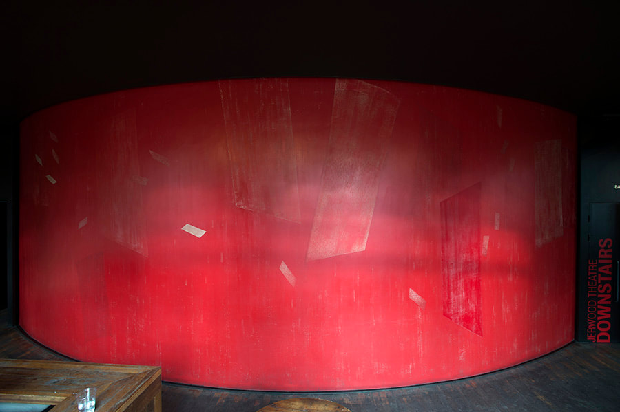
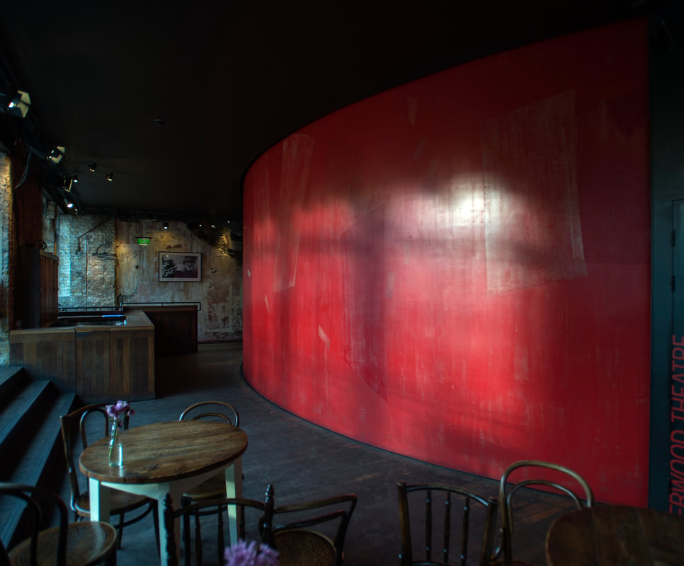
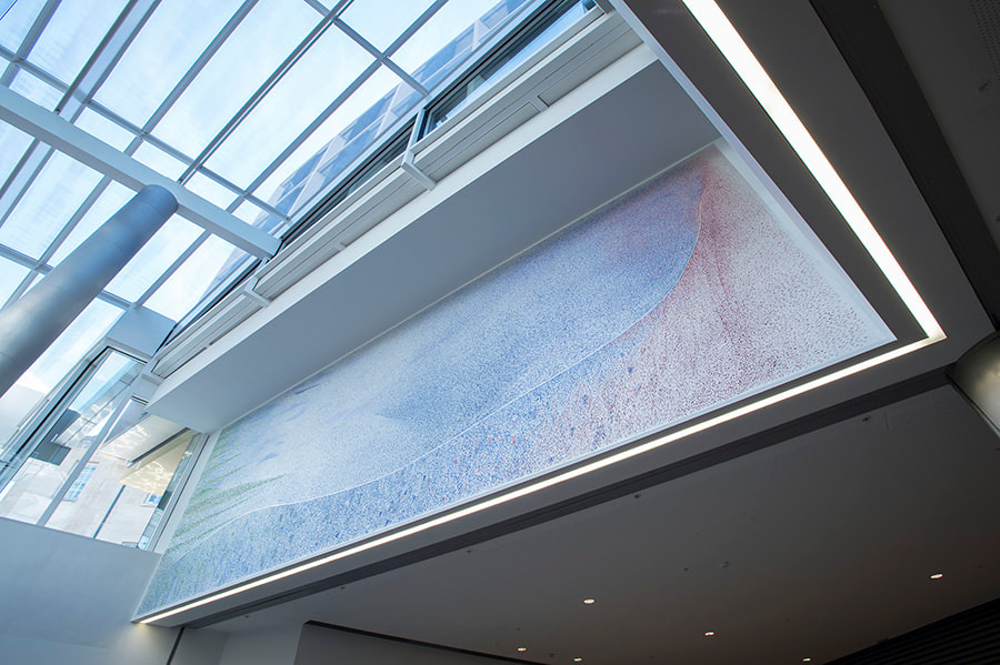
My first commission in London was to colour-transform the foyer spaces of the, then being refurbished, Royal Court Theatre. I painted my light movement notation on the 85 square metre drum wall, spanning the three floors, using mainly the genuine vermilion pigment. It was my visit to Pompeii and the studies I made of the paintings at Villa of the Mysteries that made me use this pigment at the Royal Court Theatre. There is something about this red, that makes it a space-generating colour. The Greeks observed that vermilion is the only colour uniting the elements of light and darkness, because in full sunlight it appears brightest of all colours while in dark it looks darkest. The redness of vermilion is very special, a pure red (neither bluish nor orangey), absorbing all but the red within the spectrum. It tricks our ability to perceptually process this optical information. Therefore it appears unstable; its appearance constantly moving between different reddish shades. This perceptual instability extends into altered “reading” of the architectural space. The space seems much larger than it actually is.
There is also an emotional aspect of that red, it’s pure quality makes it neutral – neither happy nor sad. It corresponds equally well to a tragedy and to a comedy. As painters we often use musical analogies: vermilion could be described as a seventeen century Venetian cello. A note played on such a cello produces a number of harmonics in the high register and a number of harmonics in the lower register. In the language of musicians we can hear the light and the dark simultaneously. The Vermilion Wall does it visually.
The Royal Court Theatre commission was my first collaboration with Haworth Tompkins Architects – many more followed.
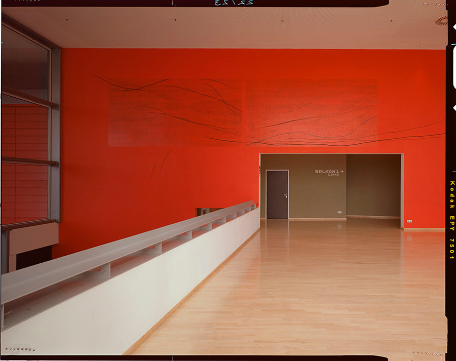
The vermilion adventure took me to Rotterdam where I interacted with the amazing vast spaces of Bolles Wilson’s Luxor Theatre. There, 20sq m vermilion and lamp black painting superimposed onto a huge red wall that spans the whole building, alters the spatial perception in a different way.
Peter Wilson observed that from two floors below it seems to dissolve the wall into jellyfish –like transparent ripples. Front on it introduces unexpected intimacy through the changed status of the 30 meters wall, a dimensional modification of architectural space. This transformation is achieved by painting with only two pigments – genuine vermilion (sulphite of mercury) and lamp black (soot). The vermilion (because of mercury) is very heavy but appears light, the soot is very light but appears dark. It is not only hues but predominately the characteristics of pigments that really matter.
In our globalised world a shocking 90% of all painted surfaces are covered with one and the same pigment – titanium white (dioxide of titanium ), the main component of any emulsion paint. Cheep to produce and easy to paint with, it is tinted with synthetic dyes into a whole range of RAL colours. However, it’s light reflecting qualities with the very low level of refraction produce dull, flat surfaces.
In order to produce optical space we need contrasts that involve tonal values, shifts of colour temperature and varied reflectivity.
The new technologies offer whole range of new pigments that if intelligently used, can help to produce interesting new spaces.
Luxor Theatre Rotterdam
Shadow Synchrony, 2002. Photo by John Riddy. 
Painting the wall piece. Photo by Rob t’Hart.
The Coin Street Neighbourhood Centre elevation, another collaboration with HTA is constructed of textured glass panels. A combination of three shades of ochre was enamelled on the flat side of the glass – two warm and one cold. The verticals were painted red, again warm on the West side and cool on the East side.
The combination of cool and warm colours allows for a surface to adjust itself, in a sense, to the changing weather, the changing colour of light and so different colours come forward. The carefully orchestrated tones of the façade extend into the building. There, next to the façade’s windows a colour zones are created. The large ventilation shafts are painted with combination of dark indigo and iridescent dark blue. While creating a feeling of depth, they also strongly reflect daylight and project hand-painted shapes and lines onto the other side of the street.
These shapes relate to the real sun patches, which create another layer of colourful shapes on occasionally sunny days. On a grey day the shafts become imaginary gardens of various colours and tones. On a bright day, patches of sunlight activate the painted surfaces and create a fanfare of shades and reflections – colour therapy for both users of the building and passers-by.
At night, the façade changes dramatically. The street lights make the outer textured glass look like gold silk while the internal lights pick up the colours from the ventilation shafts. The multitude of colours is created purely by the reflexions thrown off by the painted surfaces. Not visible during the day, the nocturnal interactions of shapes and shadows turn the façade into a theatre of colours.

London light is influenced, a great deal, by certain darkness of the Atlantic light, which is very much visible in shadows. The shadows become very black and therefore we have to think about harmonising colours accordingly, which is often forgotten by architects.
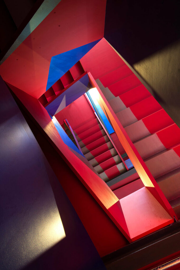
Colour works by interaction with other colours and depending on the project, this can be interaction of very bright colours like for example the staircase I did, again with Haworth Tompkins, for the Donmar Theatre studios. Here the very bright, matte colours form backgrounds to shapes, which are hand painted with metallic and pearlescent paints. The strong colours reflect on each other creating an immaterial colour saturated vertical structure that is floating within the haptic staircase.
On the walls of the foyer of the Rafael Viñoly’s Mathematical Institute in Oxford I prepared a mica background, a very reflective surface on which I painted with the combination of a quite heavy crystalline pigments and the super light nanotechnology interference pigments that bend light wavelengths . This combination of light’s reflections and refractions creates a shimmering veil of colour that interacts with the whole space of the foyer. This is constantly changing with light and with the movement of the viewer – I called this art work Spectral Flip.
Colour is a layer of space – in order to manipulate it one has to understand the range of contrasts that can provide a structure for a successful colour design.
Nearly 20 years ago at the AA School of Architecture I set up a course called Materiality of Colour and began teaching the basis of colour interactions. I still teach this course, now called Politics of Colour, which follows Joseph Albers’ seminal work in 2D, but also extends it into 3D. I also want the students to understand the principles of the subtractive colour phenomenon and how it interacts with the additive colour of light. Some basic understanding of the physics of colour helps to articulate volumetric interactions. When a design is chromatically informed it gains fuller perceptual qualities and achieves more depth visually and intellectually.
In my colour course I focus on practical work. I encourage students to follow some of Albers’ 2D exercises and extend them into 3D colour constructs. Interaction of colour in 3D is different and has to be practically tested. By focusing on the characteristics of colours – such as dark/light, warm/cool, reflective/absorbent and how they interact with different light conditions, the students gain a better understanding of the colour phenomenon. The hands-on work is accompanied by a written analysis. This prepares students for more focused and precise description of the colour interactions in their designs.
When I began teaching at the AA, all the images in the Slide Library were black and white. Now, colour is omnipresent – end of year Projects Review exhibition is a riot of colours. However, colour is seldom discussed – there is a lack of language that would allow for a precise analysis of colour within the architectural practice.
A few years ago, Professor Fiona MacLachlan’s research revealed that I run the only structured practical colour course in an architectural school in UK. While it is exciting to be unique I feel that an opportunity is being missed to spread this knowledge in a systemic way to other institutions and to enable the architecture students of the future to understand the crucial role of light and colour in their work.


LEARN MORE ABOUT ANTONI’S WORK, VISIT HIS WEBSITE HERE.

TEACHING COLOUR IN ARCHITECTURE
PROFESSOR FIONA MCLACHLAN
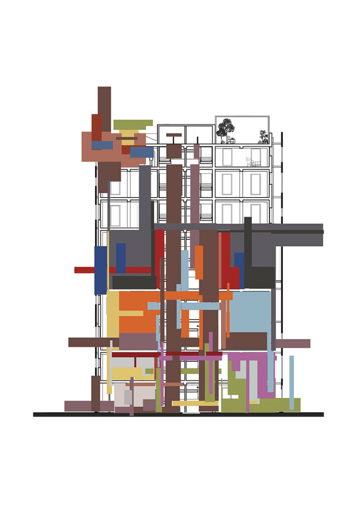
The Chromatic Interventions design studio at ESALA (2020), University of Edinburgh, invited third year students to retrofit a 1965 tower block sited in a mental health hospital. The studio was led by architects Fiona McLachlan and Rachael Scott. Fiona has been teaching colour studios for the last five years, drawing on ten years of research into colour in architectural design and over thirty years in practice and design teaching.
The studio started by establishing an intellectual framework through seminars, readings, painting and modelmaking. Students, working in groups, then derived a colour palette by observation and analysis of a secondary source, which they then applied to retrofit the tower to a given brief : Body and Mind with a mix of community functions such as yoga, art, sewing, upcycling, boxing, a community kitchen, wintergarden, and marketplace.
The colour palettes developed through this analytical process tend to be broader, more tonally complex than selecting colour arbitrarily. Students also learn to develop a conceptual colour strategy for the application.
Works exhibited are in three groups:
Sofia King de Regoyos, Carmen Parte and Izzy Fraser: Sunsets and Sunrises
The students climbed three different hills at sunrise and sunset each day for a week to document the changing skies. The unexpectedly wet conditions affected the way in which colour is experienced, making a complex palette full of transparency and translucency.
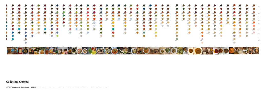
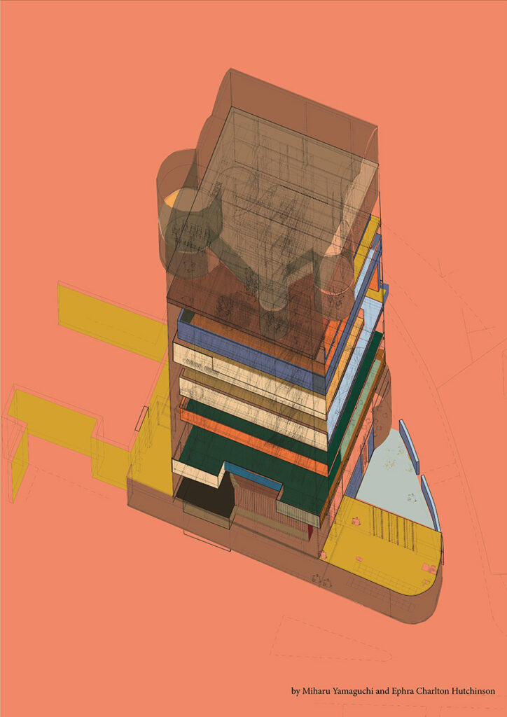
Miharu Yamaguchi and Ephra Charlton Hutchinson: The colour of food
A rigorous research project asked international friends to document the colour of ingredients and their final meal each evening. These formed a rich yellow/brown colour palette, with the occasional splash of turquoise from a serving plate.
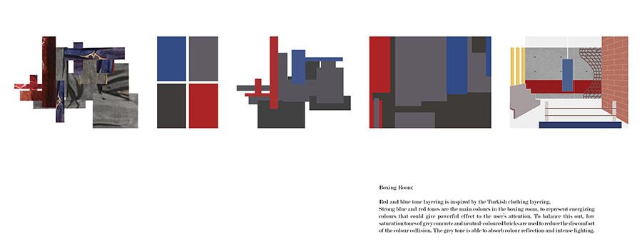
Tan Calin, Haidah Haidi and Sarea Fang: Clothes and Cultural Colour
With all teaching online due to the pandemic, and with students distributed across the globe, this group drew on their three different cultures- Turkey, Malaysian and China, to study the colours and layering of historical clothes.
COLOUR IN ARCHITECTURE TODAY
By HARRIET THORPE
In a visual, digital world of competing voices, personalities and designs, colour is one of the most important tools for individual expression. And in our global world, colour is a useful code that doesn’t require language. But what really characterises ‘today’, is that we can see clearer into the near-future than we ever have done before. This is driving new approaches to sustainability and technology that will revolutionise colour like we have never experienced it before.
While some saw the revival of colourful Post-modern architecture as a reaction to the grey-scale of late modernism, others see it as a pre-cursor to a new era, capturing the pluralism and disorder of a society on the brink of a fourth industrial revolution driven by technology and automation. Combining emotion, dynamism and symbolism, colour has been a central tool to Po-mo’s contemporary disciples, as seen in FAT’s outrageous collaging; Adam Nathaniel Furman’s pursuit of pleasure; or CAN’s classical rebellion.
Beyond colour-coded way-finding and metro maps, progressive cities have adopted colour to combat the problems of globalisation – homogenised built environments and cultural clashes – using it for education, wellbeing and cross-cultural communication. Transport for London uses bright ceramic tiles, surreal installations and large scale murals by artists to start conversations and explore the complexities of the city. Elsewhere in London, designer Yinka Ilori’s ‘The Happy Street’ brings a West African colour palette to an underpass. In Copenhagen’s Nørrebro, a neighbourhood known for its diversity, the technicolour Superkilen park by BIG, Topotek1 and Superflex uses colour to represent cultural identity.
Are vast experiences of artificial colour in architecture sustainable though? Research has shown that synthetic paint and dyes can be toxic for health and the environment. In response, some designers are returning to natural dyes, which could mean colour becoming more localised again. Mexican designer Moisés Hernández for example prefers to work with traditional cochineal red; while LUMA Arles is re-discovering regional palettes though locally sourced pigments in its project Colour Geographies.
As global warming continues, purging architecture of colour and choosing white instead might become more common. White has been used on buildings for centuries in warmer climates to reflect light and heat. A recently discovered new white paint with enhanced cooling properties, which reflects 98 per cent of sunlight as well as infrared heat, might become more visible in cities as a solution to reduce air conditioning.
A loss of colour in our physical worlds, will certainly be made up for in our digital spaces however. We’ve already seen the Photoshop-inspired ‘fade’ gradient which made its way onto art, objects and wallpaper, but MIT’s research into ‘reprogrammable paint’ suggests that the colour of an object could be continually customised, potentially reducing waste through less demand for new goods. Architects Space Popular suggest that in our increasingly digital world, individuality will further strengthen, because we will be able to change the colours of our environments at whim. Influenced by digital colour trends entering into physical space, architect Jennifer Bonner explores how colour can be used to ‘fake’ materials such as marble. Looking at the colour scheme on the world’s first NFT house, it seems like we are in for a ride.